
Why 74% of Customers Leave Your Website (And How to Fix It)
Aug 9, 2025
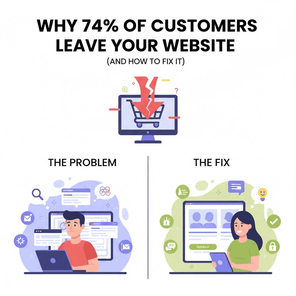
Three out of four people who visit your website leave immediately.
They don't read your services. They don't fill out your form. They don't call you.
They just... leave.
74% of users abandon a website because of its design.
Not because your product is bad. Not because your prices are too high.
Because your website sucks.
Let me show you exactly why they're leaving and how to fix it.
The 3-Second Rule
Here's something most business owners don't know.
You have 3 seconds to convince someone to stay on your website.
Three. Seconds.
That's it.
In those 3 seconds, visitors decide:
Is this professional?
Can I trust this company?
Will I find what I need here?
If any answer is "no," they're gone.
Your competitor just got a customer you should have won.
The Top 7 Reasons People Bounce (And How to Fix Them)
Reason #1: Your Site is Slow as Hell
The problem:
If your site takes more than 3 seconds to load, 53% of mobile users leave.
Every additional second costs you 7% of conversions.
Think about that.
A 5-second load time? You're losing 14% of potential customers before they even see your site.
The fix:
Compress images (biggest issue for most sites)
Use modern hosting (not that $5/month garbage)
Minimize code bloat
Enable caching
Use a CDN
At BSLabs, our sites load in under 2 seconds.
Because we know: Speed = Money.
Reason #2: It Looks Like 2010 Called
The problem:
Your website screams "outdated" the second it loads.
Visitors think:
"If their website is this old, what else is outdated?"
"Do they even still run this business?"
"Can I trust them with my money?"
Design trends evolve fast. A site from 2018 looks ancient in 2025.
The fix:
Modern design principles:
Clean, minimalist layouts
Plenty of white space
Bold, readable fonts
High-quality images (not stock photos from 2005)
Contemporary color schemes
Smooth animations and transitions
You don't need to reinvent the wheel.
Just look modern and professional.
Reason #3: It's a Disaster on Mobile
The problem:
60% of website traffic is mobile now.
But your site was designed for desktop in 2015.
On mobile, it's a nightmare:
Text too small to read
Buttons too tiny to click
Images overlapping
Have to pinch and zoom constantly
Forms are impossible to fill out
Mobile users leave even faster than desktop users.
The fix:
Mobile-first design:
Responsive layouts that adapt
Touch-friendly buttons (minimum 44×44 pixels)
Readable text without zooming (16px minimum)
Simplified navigation for small screens
Fast mobile load times
Test your site on actual phones. Not just Chrome's mobile view.
Real devices. Real networks.
Reason #4: Nobody Knows What to Do Next
The problem:
Visitors land on your homepage and think: "Now what?"
No clear call-to-action. No obvious next step.
They're confused. So they leave.
88% of users won't return after a bad experience.
You get one shot. Don't waste it on confusion.
The fix:
Crystal clear CTAs:
One primary action per page
Obvious buttons ("Get Started," "Book Now," "Get Quote")
Contrasting colors that stand out
Multiple opportunities to take action
Remove distractions from conversion path
Every page should answer: "What should I do next?"
Make it obvious. Make it easy.
Reason #5: The Navigation is a Maze
The problem:
Your menu has 47 options.
Dropdown menus with dropdowns inside dropdowns.
Visitors can't find anything. So they give up.
The fix:
Simplified navigation:
Maximum 5-7 main menu items
Clear, descriptive labels (not clever names)
Logical organization
Search function for complex sites
Breadcrumbs on deep pages
If your mom can't figure out your navigation, it's too complex.
Simplify.
Reason #6: It Doesn't Build Trust
The problem:
Visitors land on your site and their scam-detector goes off.
Why?
No social proof
No client testimonials
No case studies
Generic stock photos
No physical address or contact info
Looks like it was built on Wix in 2012
They don't trust you. So they don't buy.
The fix:
Trust signals everywhere:
Real client testimonials (with names and photos)
Case studies with actual results
Client logos (if B2B)
Professional photography (not stock images)
Clear contact information
Security badges
About page with real team photos
Industry certifications
Look at our site.
18 client testimonials. From real people. Different countries. Different industries.
That's how you build trust.
Reason #7: The Content is Terrible
The problem:
Your website is all about YOU.
"We are the leading provider..."
"We have been in business since..."
"We pride ourselves on..."
Me. Me. Me.
Visitors don't care about you.
They care about their problems and whether you can solve them.
The fix:
Customer-focused content:
Lead with benefits, not features
Speak to pain points directly
Use "you" more than "we"
Show results, not just services
Answer questions clearly
Use simple language (5th-grade reading level)
Bad: "We are a leading provider of web solutions."
Good: "Get more customers with a website that actually works."
See the difference?
The Real-World Impact
Let me show you what happens when you fix these issues.
Marketing Agency (São Paulo)
Before fixes:
10,000 visitors/month
65% bounce rate
2.3% conversion rate
Slow load times (5+ seconds)
Confusing navigation
After fixes:
16,500 visitors/month
42% bounce rate
3.8% conversion rate
Load time under 2 seconds
Clear conversion paths
Gabriela Santos (Marketing Manager): "We've seen a 65% increase in organic traffic within three months."
Result: 147% increase in leads
Legal Firm (Berlin)
Before fixes:
Looked outdated
No trust signals
Poor mobile experience
After fixes:
Modern, professional design
Multiple testimonials
Perfect mobile experience
Oliver Schmidt (Owner): "We've received numerous compliments, and our contact form submissions have increased significantly."
Result: 40% more contact submissions
These aren't miracles.
This is what happens when you fix the obvious problems.
The Mobile Problem Nobody Fixes
Here's something crazy.
60% of traffic is mobile.
But most businesses optimize for desktop first.
Big mistake.
Mobile users have different needs:
They're often on the go
They want info fast
They won't tolerate slow loads
They use their thumb to navigate
They're probably distracted
Your mobile experience should be:
Faster than desktop
Simpler than desktop
More focused than desktop
Every element on mobile should earn its place.
If it doesn't help the user, delete it.
The Testing Process That Reveals Everything
Want to know what's broken on your site?
Do this:
The 5-Second Test
Show your homepage to someone for 5 seconds.
Then ask:
What does this company do?
Who is it for?
What should I do next?
If they can't answer, your site fails.
The Mom Test
Can your mom navigate your site and complete an action?
If not, it's too complex.
The Phone Test
Pull out your phone. Right now.
Try to complete a purchase or fill out a form.
How frustrating is it?
That's what your customers experience.
The Slow Internet Test
Throttle your internet to 3G speeds.
Try loading your site.
Still usable? Great.
Takes forever? Fix it.
The Quick Wins (Fix These Today)
You don't need a full redesign to see improvements.
Start with these quick fixes:
1. Compress All Images
Use tools like TinyPNG or ImageOptim.
This alone can cut load time in half.
2. Add Clear CTAs
Every page needs an obvious next step.
Make the buttons big and obvious.
3. Fix Mobile Issues
Test on real devices. Fix anything broken.
This is 60% of your traffic.
4. Add Testimonials
3-5 client testimonials with names and photos.
Social proof = trust = conversions.
5. Simplify Navigation
Cut your menu in half.
If it's not essential, remove it.
6. Speed Up Your Hosting
Move off that cheap shared hosting.
Invest in quality hosting or a CDN.
7. Add Exit-Intent Popups
Catch people before they leave.
Offer something valuable in exchange for their email.
These fixes take a few days maximum.
But can increase conversions by 20-40%.
When You Need a Full Redesign
Sometimes quick fixes aren't enough.
You need a complete redesign when:
❌ Site built more than 3 years ago
❌ Bounce rate over 60%
❌ Conversion rate under 2%
❌ Mobile experience is broken
❌ You're embarrassed to share your URL
❌ Competitors' sites look way better
❌ Technology is outdated
If you checked 3+ boxes, you need a redesign.
Not a refresh. A complete rebuild.
What a Professional Website Actually Includes
Here's what separates amateur sites from professional ones:
Amateur Site ($3,000-$10,000):
Template design
Basic pages
Generic content
DIY setup
No strategy
"Good enough" attitude
Professional Site ($80,000-$150,000):
Custom design for YOUR customers
Strategic conversion paths
Professional copywriting
Technical optimization
Ongoing improvements
Revenue-focused approach
The difference?
One is an expense. The other is an investment.
One looks okay. The other makes you money.
Real Client Example
Creative Agency (Cape Town)
They came to us frustrated.
Beautiful portfolio. Great work. But their website wasn't converting.
The problems we found:
Load time: 6.2 seconds
Mobile experience: broken
No clear CTAs
Navigation: confusing
Content: all about them, not clients
What we did:
Rebuilt from scratch
Load time: 1.8 seconds
Mobile-first design
Clear conversion paths
Customer-focused content
Aisha Mbeki (Creative Director): "They were patient with our multiple revision requests and delivered a polished, professional product that our clients frequently compliment."
Result:
Traffic stayed similar. But conversion rate doubled.
Same visitors. Double the clients.
That's the power of fixing what's broken.
The Bottom Line
74% of people are leaving your website.
Every. Single. Day.
That's not a statistic. That's money walking away.
The question is: Are you going to keep bleeding customers?
Or are you going to fix it?
At BSLabs, we specialize in websites that convert.
Not pretty brochures. Not digital business cards.
Websites that bring you customers.
Fast. Professional. High-converting.
Want to see what's broken on YOUR site?
Get a free website audit — We'll show you exactly why people are leaving and how to fix it.
No sales pitch. Just honest analysis.
Because here's the reality.
You're not just losing visitors.
You're losing customers to competitors whose websites actually work.
How long can you afford that?
Ready to stop the bleeding?
Let's fix your website and start converting those 74% into customers.
BSLabs — Fast website and app development for businesses that mean business. No cheap work. No endless delays.
© 2026 BSLabs | webdevdesignz.com. All rights reserved.